
This example demonstrates how to add a title and axis labels to a chart using the title, xlabel, and ylabel functions. It also illustrates how to customize the font size of the axis text for better visual appearance.
Generate a Simple Line Plot
Define x as 100 linearly spaced values between −2π and 2π. Then, compute y1 and y2 as the sine and cosine of x, respectively. Finally, plot both data sets on the same graph.
x = linspace(-2*pi,2*pi,100);
y1 = sin(x);
y2 = cos(x);
figure
plot(x,y1,x,y2)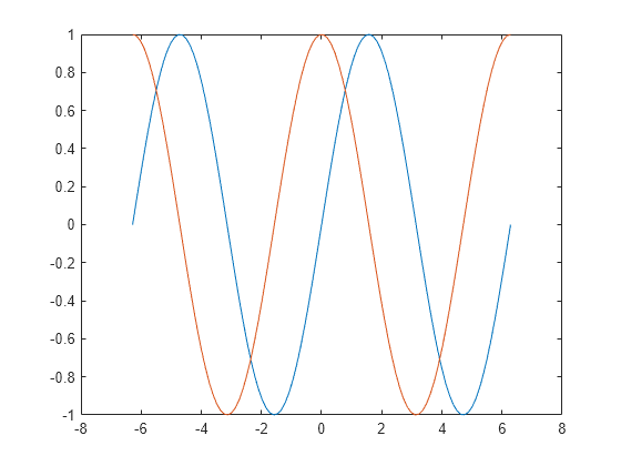
Add a Title
To add a title to your chart, use the title function. If you want to display the Greek symbol π, simply use the TeX markup \pi.
title('Line Plot of Sine and Cosine Between -2\pi and 2\pi')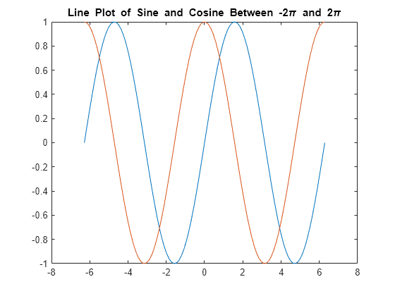
Add Axis Labels
Label the axes of your chart using the xlabel and ylabel functions for better clarity.
xlabel('-2\pi < x < 2\pi')
ylabel('Sine and Cosine Values') 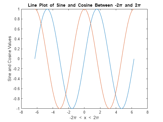
Add Legend
Include a legend in your graph to label each data set with the legend function. Provide the legend descriptions in the same order as the plotted lines. You can also choose a specific location for the legend by using one of the eight cardinal or intercardinal directions, such as ‘southwest’.
legend({'y = sin(x)','y = cos(x)'},'Location','southwest')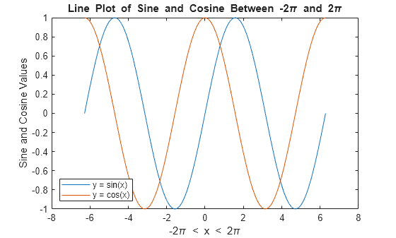
Change Font Size
Axes objects in MATLAB come with properties that allow you to personalize the look of your axes. One such property, FontSize, controls the font size for the title, labels, and legend.
To modify the font size, first access the current Axes object using the gca function. Then, use dot notation to adjust the FontSize property.
ax = gca;
ax.FontSize = 13;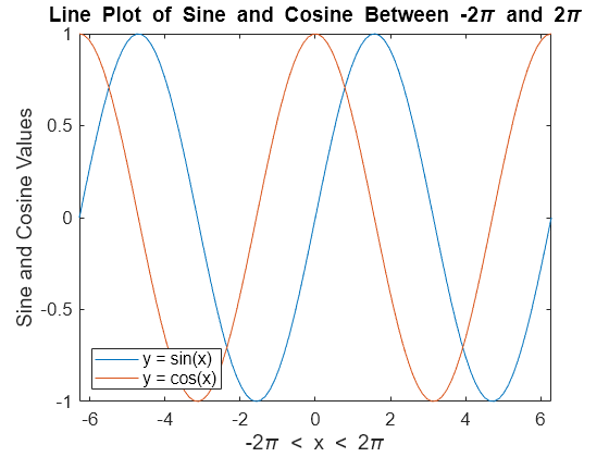
Title with Variable Value
To include a variable value in the title text, use the num2str function to convert the value to a string. This method can also be applied to axis labels or legend entries.
For example, to add a title with the value of sin(π)/2, you can write:
k = sin(pi/2);
title(['sin(\pi/2) = ' num2str(k)])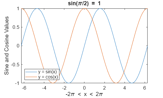
Frequently Asked Questions
Why is it important to add a title to a chart?
Adding a title to a chart helps provide context and clarity, allowing viewers to quickly understand the purpose or subject of the data being presented.
How do I add a title to a chart in Excel?
In Excel, click on the chart, then go to the “Chart Design” tab, select “Add Chart Element,” and choose “Chart Title.” You can either add a title above the chart or position it where you like.
Can I customize the title text in a chart?
Yes, once the title is added, you can click on the title text box and customize the font, size, color, and style through the formatting options available.
How do I add axis labels to a chart in Excel?
To add axis labels in Excel, click on the chart, go to “Chart Design,” select “Add Chart Element,” and then choose “Axis Titles.” You can add titles for both the horizontal (X) and vertical (Y) axes.
What is the difference between a title and an axis label?
A title describes the overall chart, while axis labels describe the variables being plotted on the X (horizontal) and Y (vertical) axes.
Can I add a subtitle to my chart for further context?
While Excel doesn’t have a specific option for a subtitle, you can manually add a text box below the chart title for additional context or description.
What if my axis labels overlap on the chart?
To resolve overlapping axis labels, you can adjust the text angle or shorten the labels. You can also increase the chart’s size or adjust the axis settings to accommodate the labels better.
Can I change the position of the title or axis labels on a chart?
Yes, you can drag and reposition the chart title or axis labels. Alternatively, you can change their alignment settings under the “Format” tab for more precise positioning.
How do I add labels for both the primary and secondary axes in a chart?
For charts with multiple axes, go to “Add Chart Element,” select “Axis Titles,” and choose whether to add titles for the primary or secondary axes. You can label both horizontal and vertical axes.
Is it possible to add dynamic titles to a chart in Excel?
Yes, you can create dynamic chart titles by linking the title to a cell that contains a formula or text. This allows the title to update automatically based on changes in the linked cell.
Conclusion
Adding a title and axis labels to your MATLAB charts is essential for making your plots more informative and easier to understand. By using the title(), xlabel(), and ylabel() functions, you can clearly define what your chart represents. These labels can also include dynamic values, such as variable values or mathematical expressions, using the num2str() function or sprintf() for more control over formatting.
By mastering this technique, you enhance the clarity of your charts, making them not just visually appealing, but also highly informative for anyone interpreting your data. Whether you’re working with static data or real-time updates, well-labeled charts provide clear insights and add professionalism to your MATLAB visualizations.
