

Annotations are additional pieces of information that help emphasize important elements within a chart. In this example, we’ll first explore the different types of annotations and then demonstrate how to add circles and text arrows to a chart to highlight key points.
Types of Annotations
To add annotations to a chart, you can use the annotation function in MATLAB. The first input defines the type of annotation you want to create.
- If you choose ‘line’, ‘arrow’, ‘doublearrow’, or ‘textarrow’, the second input specifies the starting and ending x positions, while the third input specifies the starting and ending y positions. For example:
annotation('line', [x_begin x_end], [y_begin y_end])
For ‘rectangle’, ‘ellipse’, or ‘textbox’, the second argument defines the location and size. For example:
matlabCopyEditannotation('rectangle', [x, y, w, h])Creating a Simple Plot
To start, you can define and plot the functions f(x) and g(x):
x = -3.0:0.01:3.0;
f = x.^2;
g = 5*sin(x) + 5;

figure
plot(x,f)
hold on
plot(x,g)
hold off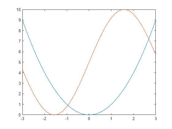
Circle Annotations
To highlight where f(x) and g(x) intersect, you can add a circle to the chart using the ‘ellipse’ option in the annotation function.
You can customize the circle by modifying properties of the underlying ellipse object. To do this, return the Ellipse object as an output from the annotation function, and then use dot notation to access and adjust its properties. For example, to change the color of the circle, you can do the following:
elps = annotation('ellipse',[.84 .68 .05 .05])
elps =
  Ellipse with properties:

        Color: [0 0 0]
    FaceColor: 'none'
    LineStyle: '-'
    LineWidth: 0.5000
     Position: [0.8400 0.6800 0.0500 0.0500]
        Units: 'normalized'

  Use GET to show all properties
Get
elps.Color = [0 0.5 0.5];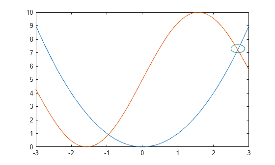
Text Arrow Annotations
To add a text arrow to your chart, use the ‘textarrow’ option for the annotation type. This allows you to combine both an arrow and a text label in your chart, making it easier to highlight key information.
You can further customize the text arrow by modifying properties of the underlying object. By returning the TextArrow object as an output from the annotation function, you can access and adjust its properties using dot notation. For instance, you can set the String property to display the desired text and the Color property to change the arrow’s color. Here’s an example:
ta = annotation('textarrow', [0.76 0.83], [0.71 0.71])ta =
TextArrow with properties:
String: {''}
FontName: 'Helvetica'
FontSize: 10
Color: [0 0 0]
TextColor: [0 0 0]
LineStyle: '-'
LineWidth: 0.5000
HeadStyle: 'vback2'
Position: [0.7600 0.7100 0.0700 0]
Units: 'normalized'
X: [0.7600 0.8300]
Y: [0.7100 0.7100]
Use GET to show all properties
Get
ta.String = 'f(x) = g(x) ';
ta.Color = [0 0.5 0.5]; 
Frequently Asked Questions
What are annotations in a chart?
Annotations in a chart are text or markers added to specific data points, trends, or sections within a chart to provide additional context, explanations, or insights.
Why should I add annotations to my chart?
Adding annotations helps clarify important points, highlight trends, or provide additional information that makes the chart easier to understand and more informative for viewers.
How do I add annotations to a chart in Excel?
To add annotations in Excel, you can use the “Insert” tab, select “Text Box” or “Shapes,” and then place them on the chart at the desired location. You can also use “Data Labels” or “Callouts” for specific points.
Can I add annotations in Google Sheets charts?
Yes, in Google Sheets, you can add annotations by clicking on the chart, selecting “Customize,” and then adding data labels or using text boxes to highlight specific points or trends.
Can I add annotations to a chart in Python using Matplotlib?
Yes, you can add annotations in Matplotlib using the annotate() function. It allows you to add text, arrows, and other markers to specific chart elements.
What types of annotations can be added to a chart?
Common types of annotations include:
- Text annotations (labels or descriptions)
- Arrows (to point to specific data points)
- Shapes (such as circles or boxes to highlight areas)
- Lines (to mark trends or boundaries)
Can I add interactive annotations to a chart?
Yes, you can create interactive annotations in charts using tools like Plotly or other JavaScript chart libraries. These annotations can be interactive, allowing viewers to hover or click to get more information.
Is it possible to remove or edit annotations in a chart?
Yes, annotations can be edited or removed. In most charting tools (e.g., Excel, Google Sheets, or programming libraries), you can click on the annotation and either edit the text, change the style, or delete it.
How can I add annotations to a chart in Tableau?
In Tableau, you can add annotations by right-clicking on a specific point or area in your chart and selecting “Annotate” from the context menu. You can then add a point, area, or mark annotation.
Are there any best practices for adding annotations to a chart?
Yes, here are some best practices:
- Keep annotations concise and relevant.
- Ensure annotations don’t clutter the chart.
- Use clear formatting (e.g., bold, color) to make annotations stand out.
- Position annotations close to the data they reference for better clarity.
Conclusion
Annotations are powerful tools for highlighting important data points and providing additional context in your MATLAB charts. Whether you’re using text arrows, lines, rectangles, or other shapes, annotations can make your plots more informative and visually engaging. By customizing annotation properties like color, size, and text, you can create a more dynamic and interactive visualization. Whether you’re working on scientific data, presentations, or reports, mastering the use of annotations will help you convey your message clearly and effectively to your audience.