Legend to Graph are essential for labeling data series on a graph. These examples demonstrate how to create a legend and customize it, including adjusting its location, changing the font size, and adding a title. You can also create multi-column legends or limit the legend to a subset of the plotted data.
Create Simple Legend
Create a figure that includes both a line chart and a scatter chart. Add a legend to provide descriptions for each chart, specifying the labels directly as inputs to the legend function.
figure
x1 = linspace(0,5);
y1 = sin(x1/2);
plot(x1,y1)

hold on
x2 = [0 1 2 3 4 5];
y2 = [0.2 0.3 0.6 1 0.7 0.6];
scatter(x2,y2,'filled')
hold off

legend('sin(x/2)','2016')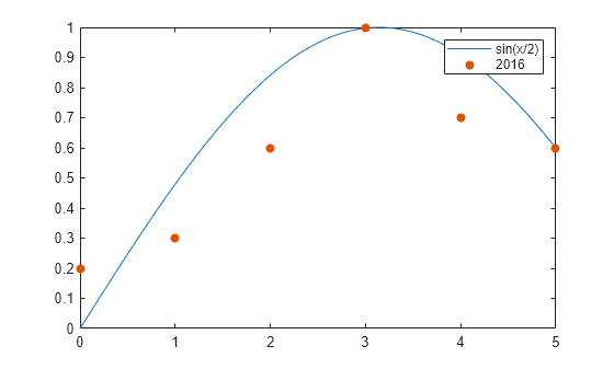
Specify Labels Using DisplayName
You can also define legend labels using the DisplayName property. Set the DisplayName as a name-value pair while calling the plotting functions, and then use the legend command to generate the legend.
x1 = linspace(0,5);
y1 = sin(x1/2);
plot(x1,y1,'DisplayName','sin(x/2)')

hold on
x2 = [0 1 2 3 4 5];
y2 = [0.2 0.3 0.6 1 0.7 0.6];
scatter(x2,y2,'filled','DisplayName','2016')

legend
Legends update automatically when you add or remove a data series. To specify labels for newly added data, use the DisplayName property. If DisplayName is not set, the legend assigns a default label like 'dataN'.
Add a scatter chart for the 2017 data.
x3 = [0 1 2 3 4 5];
y3 = [0.1 0.4 0.6 0.9 0.8 0.7];
scatter(x3,y3,'filled','DisplayName','2017')
drawnow
hold off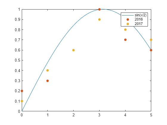
Customize Legend Appearance
The legend function generates a Legend object, which comes with customizable properties like Location, Orientation, FontSize, and Title. For a comprehensive list of options, refer to Legend Properties.
You can customize these properties in two ways:
- Using Name-Value Pairs:
Specify properties directly in thelegendcommand using name-value pairs. When using this method, the labels must often be provided in a cell array.
Example:legend({'label1', 'label2'}, 'FontSize', 14) - Using the Legend Object:
Retrieve the Legend object as an output argument using thelegendfunction (e.g.,lgd = legend). Then, set properties using dot notation.
Example:
Legend Location and Orientation
Set the legend’s location and orientation using the Location and Orientation properties as name-value pairs. Choose a location from the eight cardinal or intercardinal directions, such as ‘northwest’. Adjust the orientation to ‘vertical’ (default) or ‘horizontal’, as shown here. Define the labels using a cell array.
x1 = linspace(0,5);
y1 = sin(x1/2);
plot(x1,y1)

hold on
x2 = [0 1 2 3 4 5];
y2 = [0.2 0.3 0.6 1 0.7 0.6];
scatter(x2,y2,'filled')
hold off

legend({'sin(x/2)','2016'},'Location','northwest','Orientation','horizontal')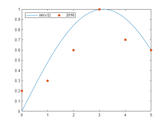
Legend Font Size and Title
Set the legend’s font size and title by adjusting the FontSize and Title properties. Assign the Legend object to a variable (e.g., lgd), and modify its properties using dot notation.
x1 = linspace(0,5);
y1 = sin(x1/2);
plot(x1,y1,'DisplayName','sin(x/2)')

hold on
x2 = [0 1 2 3 4 5];
y2 = [0.2 0.3 0.6 1 0.7 0.6];
scatter(x2,y2,'filled','DisplayName','2016')
hold off

lgd = legend;
lgd.FontSize = 14;
lgd.Title.String = '2016 Data';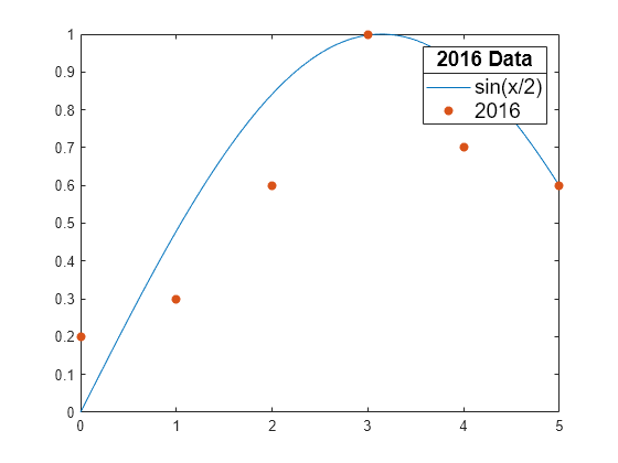
Legend with Multiple Columns
Create a chart featuring six line plots, and configure a legend with two columns by setting the NumColumns property to 2.
x = linspace(0,10);
y1 = sin(x);
y2 = sin(0.9*x);
y3 = sin(0.8*x);
y4 = sin(0.7*x);
y5 = sin(0.6*x);
y6 = sin(0.5*x);

plot(x,y1,'DisplayName','sin(x)')
hold on
plot(x,y2,'DisplayName','sin(0.9x)')
plot(x,y3,'DisplayName','sin(0.8x)')
plot(x,y4,'DisplayName','sin(0.7x)')
plot(x,y5,'DisplayName','sin(0.6x)')
plot(x,y6,'DisplayName','sin(0.5x)')
hold off

lgd = legend;
lgd.NumColumns = 2;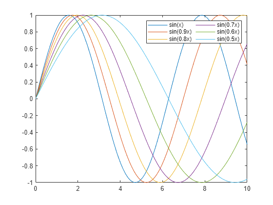
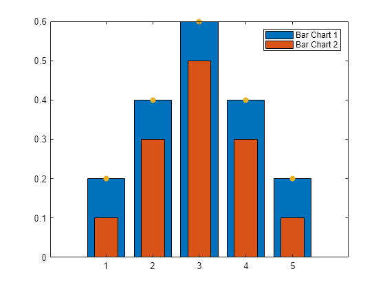
Include Subset of Charts in Legend
Combine two bar charts and a scatter chart. To create a legend that includes only the bar charts, pass the Bar objects b1 and b2 as a vector in the first input argument of the legend function.
x = [1 2 3 4 5];
y1 = [.2 .4 .6 .4 .2];
b1 = bar(x,y1);

hold on
y2 = [.1 .3 .5 .3 .1];
b2 = bar(x,y2,'BarWidth',0.5);

y3 = [.2 .4 .6 .4 .2];
s = scatter(x,y3,'filled');
hold off

legend([b1 b2],'Bar Chart 1','Bar Chart 2')